
The Inland Empire 66ers baseball team unveiled new logos that still pay tribute to Route 66 but go more in a muscle car and mechanic theme than the Route 66 shield.
The Class A minor-league team, based in San Bernardino, Calif., unveiled the logos last week at Hanger 24 Brewery in Redlands, Calif. According to the Highland Community News:
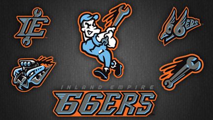
The new series of logos features an unnamed mechanic character swinging a wrench like a baseball bat. The “66ers” brand and logo was kept but stylized with a new font and “muscle car colors” of powder blue and orange. One of the logos features a stylized “IE” punctuated with a wrench. The logos were designed by the San Diego based company Bradiose.
Team owners David Elwood and Donna Tuttle were present at the unveiling and really happy with the new logos.
“I like that it fits in with the heritage of the Inland Empire and San Bernardino, and it’s a nice transition from the previous logo,” Tuttle said. “The idea is to make it come alive with the character. We were looking for something that had action to it. It was hard to take the Route 66 shield and apply any action to it.”
I like it, too. The muscle-car and mechanic themes mesh nicely with Route 66’s culture.
The 66ers are affiliated with the Los Angeles Angels.
Aren’t they really called the “Orange County Angels of Anaheim and no longer party of Los Angeles?”
I like the new look, too, but I will remain a Quakes fan.